Companion film
From model to App Home
Turn a live approval model into a routed App, exercise one guarded action, and publish the same package as App Home.
48 secGrid 0.63.2
Open film page →Guided build · 06
Turn an approval model into a routed App surface, bind explicit state, add a guarded action, test real UI states, and publish the result as App Home.
You will finish with: A three-page approval app with live records, writable input state, action feedback, capability review, and a verified App Mode handoff.
A three-page approval app over one reactive Grid model: a home summary, a searchable request queue,
and a review page whose action writes only to declared input bindings. You will build it with the
structured App Builder, test its responsive and model-driven states, inspect its capability contract,
and then open, promote, and package it as a Grid App.
Download the Starter model above. It contains the model but no surface. The Completed app is
a comparison point if you want to inspect the finished Approval_App!config and
versioned Approval_App!data document instead of reproducing every canvas edit.
Grid uses three related terms in this build:
Use the One live Table starter download for a smaller first step before the
three-page approval app. It has three model-owned request records, a declared
SelectedRequest input, and an empty Queue_App Home page. It contains no Table
block and no copied request records in the App document.
Requests to show ready with
its 1x3 array summary. Return to Model, then open Queue_App.
Confirm From model lists Requests with 3 rows.Requests for Rows.
The three requests should appear without pasting or importing any records.SelectedRequest. Now set the Table's
Select value column property to id. That property appears after selection
is bound; leaving it blank would write the row number instead of a request ID.REQ-102; Acme and River Co remain in the same table.| Table setting | Model binding or value | Purpose |
|---|---|---|
| Rows | Requests |
Read the model's three request records |
| Selected value | SelectedRequest |
Read and write selection state |
| Select value column | id |
Write REQ-102, not the second row's ordinal |
The saved Table stores binding names and presentation settings. The records stay
in Requests; selecting a row changes only the declared input. Preview is live,
so its selection is a real model write, not a simulated UI-only state.
Checkpoint: three visible rows, Northstar selected,
SelectedRequest = "REQ-102", and one Table whose Rows binding isRequests. You can now continue with the larger approval app below, which adds routing and guarded actions.
Open order-operations-starter.grid and deploy it. The public model seam is deliberately small:
output Requests = [
  { id: "REQ-101", customer: "Acme", amount: 42000, status: "pending" },
  { id: "REQ-102", customer: "Northstar", amount: 88000, status: "pending" },
  { id: "REQ-103", customer: "River Co", amount: 56000, status: "pending" }
]

input SearchRequests = ""
input SelectedRequest = ""
input Decision = "pending"
input Feedback = "Choose a request to review."

output TotalRequested IS currency = SUM(MAP(Requests, request => request.amount))
Checkpoint:
Requestshas three rows andTotalRequested = 186,000.
Requests and TotalRequested are read-only model outputs. The four input declarations are the
only writable state this app needs. Declaring a symbol in a surface write list will narrow access,
but it will not make a formula-owned value writable.
At the bottom of the workbench, open Add item and choose App. Grid creates App_1 and opens
its seeded Home page in App builder.
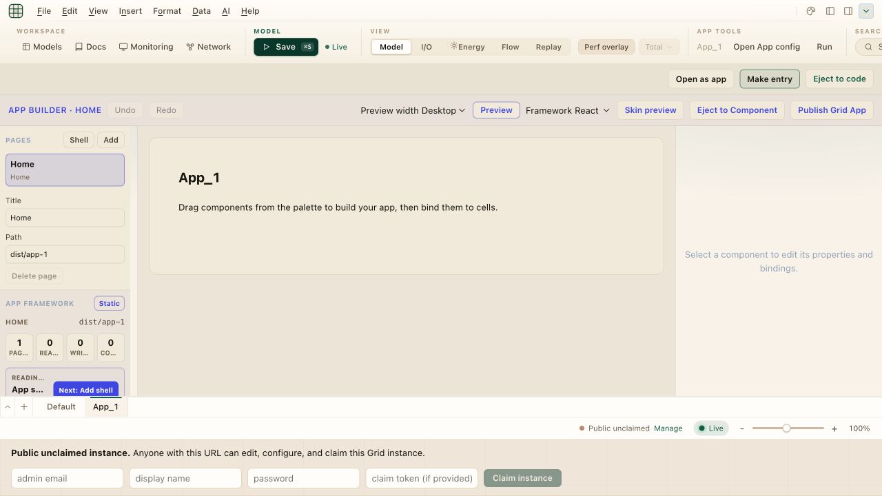
Rename the surface tab to Approval_App so its namespace matches the completed solution.
If App is absent from the menu, this deployment's custom-UI policy has disabled App surfaces; the tutorial cannot enable that policy from inside a model.
The new surface begins with one page and a prompt to drag components from the palette. In the left rail, App framework should describe the initial document as an App sketch. Nothing has been published and no custom code is running.
Switch to Default and wait until its named values and Requests rows have resolved, then return to
Approval_App. Saving or reopening preserves the App, but it does not populate an empty live-symbol
snapshot by itself. Before generating anything, verify that From model is visible in the palette
and includes Requests as 3 rows, plus SearchRequests,
SelectedRequest, Decision, Feedback, and TotalRequested.
This preflight matters in the Grid 0.65.0 candidate. Shell generation snapshots already-hydrated live values; it does not parse the source declarations. Seeing source text or a Live badge is not enough.
Checkpoint: the active tab is
Approval_App, the Pages panel contains Home, and the toolbar says App builder · Home. The model-aware palette is populated before you choose Shell.
In the Pages panel choose Shell. The same generator appears as App Shell under Starters. It
uses the resident live-symbol snapshot to add a dashboard, a records workflow, a selected-record
page, an inputs page, and Navigation components. It infers value shapes, not model ownership, so
you must still confirm that every generated write targets a declared input.
If the result is only Home plus Dashboard with 0 reads / 0 writes, the symbol catalog was empty
when Shell ran. Switch to Default until named values resolve, return to the App, confirm From
model is populated, remove that generated Dashboard, and invoke Shell once more. Repeated Shell
clicks append duplicate pages. The downloaded Completed app is the inference-free fallback when
you do not want to repair a generated draft.
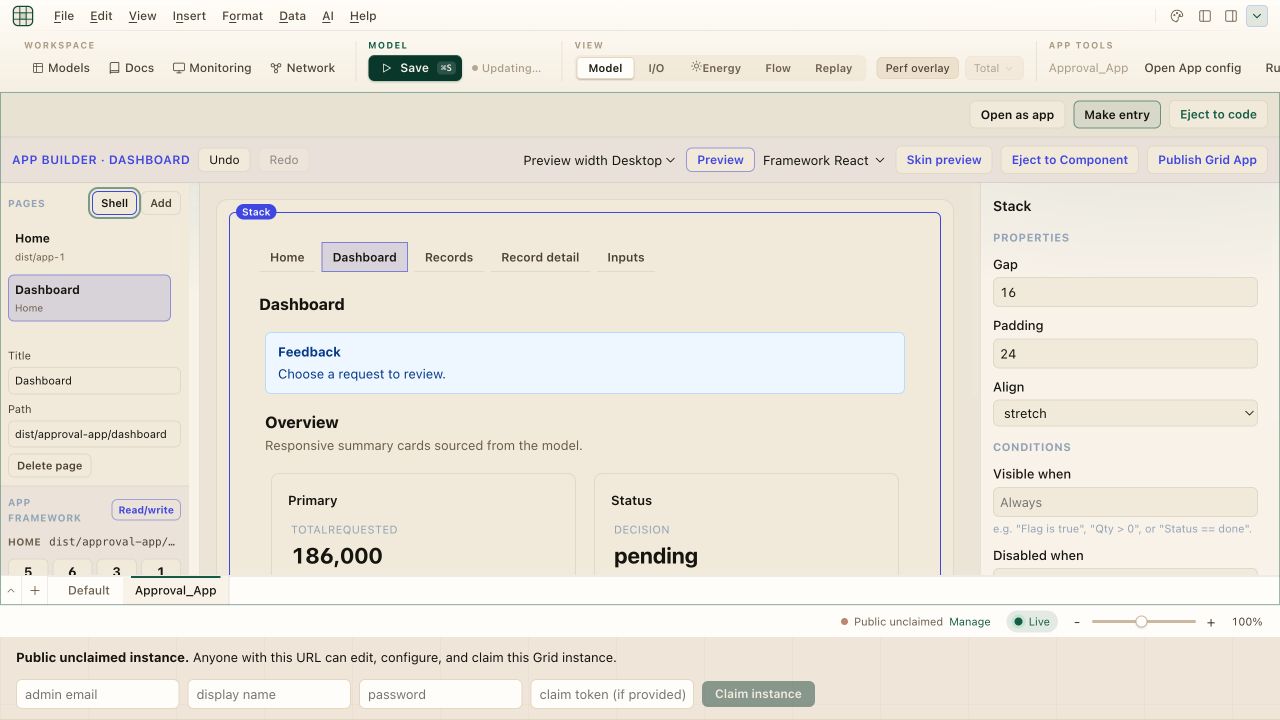
The generator makes its Dashboard the new home page, so first delete the original seeded Home page and the generated Inputs page with Delete page, then Delete page permanently. Now edit the remaining Title and Path fields as follows. Commit each field with Enter or by leaving it:
| Generated page | Title | Path |
|---|---|---|
| Dashboard | Home | dist/approval-queue |
| Records | Requests | dist/approval-queue/requests |
| Record detail | Review | dist/approval-queue/review |
Select the renamed Home page and use Set home if it is not already marked Home.
The generated shell is a starting structure, not a second backend. It chose Requests as the row
source, SearchRequests as filter state, and SelectedRequest as selection state because those
symbols have compatible live types and names.
Checkpoint: Pages lists Home, Requests, and Review. Navigation appears on all three pages, and Home is marked as the home route.
Open Requests and select its generated components on the canvas or in Outline. In the inspector, verify these Bindings:
| Component | Binding | Symbol |
|---|---|---|
| Text input | Value | SearchRequests |
| Table | Rows | Requests |
| Table | Filter text | SearchRequests |
| Table | Selected value | SelectedRequest |
| Detail on Review | Rows | Requests |
| Detail on Review | Selected value | SelectedRequest |
For the Table, set Select value column to id. The generated record cards should include an
Open Button that writes @request.id to SelectedRequest before routing to
dist/approval-queue/review. If a binding is missing, the From model section of the palette can
insert a pre-bound control, or the inspector's binding picker can repair the existing component.
On Home, bind a Metric's Value to TotalRequested and set its Format to currency.
Checkpoint: App state reports reads from
RequestsandTotalRequested, and read/write state forSearchRequestsandSelectedRequest. The canvas shows three requests and186,000without copying the sum into the UI document.
On Review, add a Badge and bind its Text to Decision. Add an Alert, bind Message from cell to
Feedback, and set its Conditions field Visible when to:
Feedback != ""
Add a Button and configure it in the inspector:
| Section | Field | Value |
|---|---|---|
| Properties | Label | Approve request |
| Properties | Action | set |
| Properties | Value / amount / route | approved |
| Properties | Route after success | dist/approval-queue/requests |
| Properties | Feedback message | Request approved. |
| Bindings | Target cell | Decision |
| Bindings | Feedback cell | Feedback |
| Conditions | Disabled when | SelectedRequest == "" |
The condition disables the action until a request is selected. At runtime, one successful action
writes Decision and Feedback, then routes back to Requests. The Builder mirrors these declared
reads and writes into Approval_App!config; it does not grant broader model access.
Checkpoint: Action builder lists the approval plan, and Capability review identifies model writes and routing. It should not report job or connector access for this app.
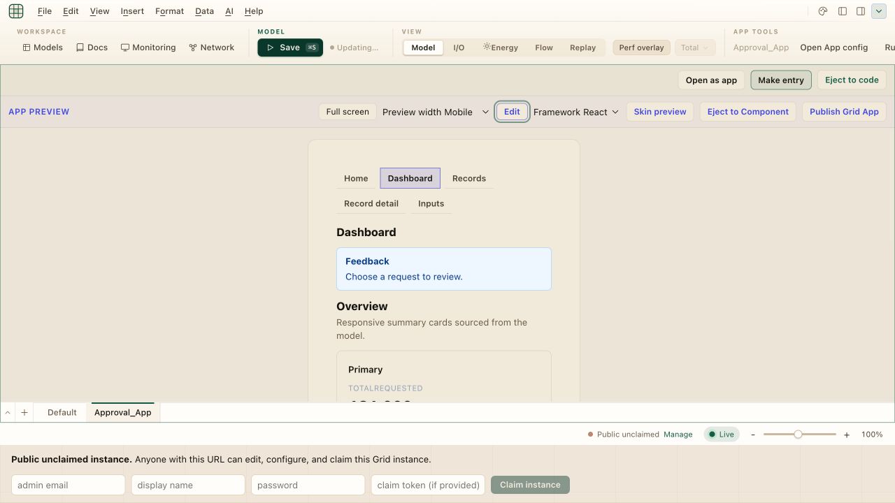
Choose Preview in the App toolbar. Preview uses the live model bindings: inputs, buttons, jobs, and connectors can perform their configured actions, including writes. Use a disposable model state when an action is destructive. Inspect layout, routing, conditions, and current values while switching the width selector through Desktop, Tablet, and Mobile, then choose Edit to return to the Builder.
This capture uses the raw five-page shell so the breakpoint change is obvious. Your cleaned-up version will show only Home, Requests, and Review in the same Mobile frame.
Test the states from the model rather than inventing local UI data:
186,000.Requests with [], deploy, and Preview
again. The Table and Repeater should show their configured empty messages. Restore the rows.Feedback input to Could not approve request., then Preview
Review. The conditional Alert should show that model-driven error message. Restore the initial
feedback text when finished.The Grid 0.65.0 candidate does not expose synthetic Empty or Error mode buttons for App surfaces. Those named preview modes belong to custom Component authoring. An App preview always renders the actual model state, so a genuine binding or compilation failure must be tested in an isolated model rather than represented as canned Builder data.
Return to Edit and inspect App framework before exposing the app. A complete shell should show:
5/5 layers ready under App readiness;model.read, model.write, and app.route behavior in Capability review;job.run or connector.call behavior; andTreat the review as a contract check, not a safety badge. model.write is expected because the app
writes four declared inputs. app.route is expected because Open and Approve change pages. Any job
or connector capability would be unexpected in this build and should be removed before continuing.
Use the three runtime actions for their distinct purposes:
SelectedRequest contains the request ID, Decision = "approved", and
Feedback = "Request approved.". This confirms the same write-and-route contract in the actual
App runtime, independently of Builder Preview.If both a promoted surface entry and a packaged Grid App exist, the packaged UI is the default App Home. Publishing the Builder package is separate from publishing a signed reusable Library to the public Registry.
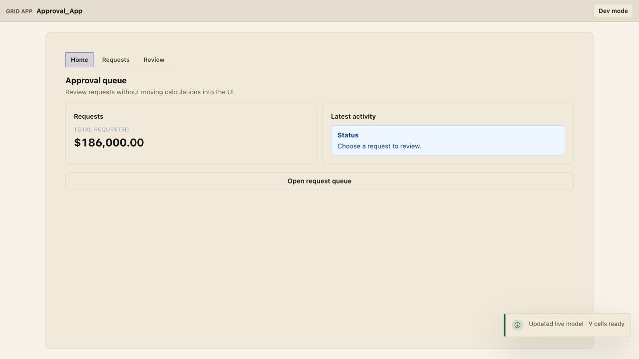
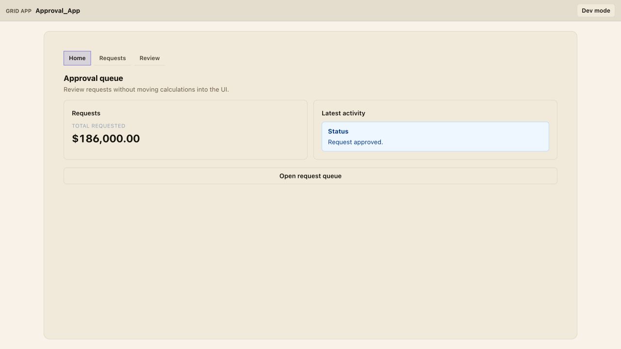
After the live action succeeds, the model-owned feedback appears wherever the app binds
Feedback—including the Home activity card.
Add a Reject Button beside Approve. Give it Action = set, Value = rejected, the same Target and
Feedback bindings, and a feedback message of Request rejected.. Keep the same disabled condition
and success route.
Then change Home's accent and test all three responsive widths. Theme and layout belong to the App document; approval calculations and writable ownership remain in the model.
input state, and Dev mode returns to the workbench.Next, take this App Builder contract to React or Vue, browse the App pattern gallery, or use Turn a model into an app to compare App Builder with specialized built-in surfaces and a narrowly scoped custom Component.